


A common dilemma for Moodle content is the size of images.
If you set the image size at 100%, everything seems too big and the image takes over the screen.

If you set a fixed size for an image then on a mobile device it causes a right scroll issue.

To solve this problem where you need an image displayed at a smaller size but still scale, it is best to use a max-width CSS style.
To do this, edit the HTML for the image in your Moodle content by adding style=”max-width:650px” into the code as shown below.
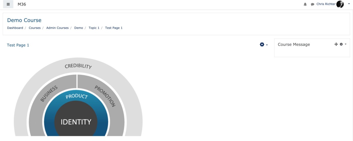
<img src="http://localhost/draftfile.php/5/user/draft/201113037/identity%20%281%29.png" alt="Temp" width="100%" height="100%" style="max-width:650px" class="img-responsive atto_image_button_text-bottom">Feel free to change the 650px to a size that suits what you need.
What this does is forces the image to have a maximum of 650px width but still scale down when on a mobile device.
I hope you find this useful and if you have any Moodle issues to solve, let me know.